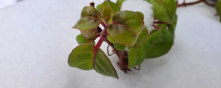
Cipher #2 is inching closer to finished. I’m still hoping to be assembling copies this weekend, altho’ i do still have to do the page numbers/table of contents plus add 1 last detail page. Those things are fairly straightforward (tho’ certainly tedious, in the case of the page numbering), so i’m hoping to get them done tonight so that i can start running copies of the contents tomorrow.
Things with the cover are still somewhat up in the air because i’ve been hoping to do them on my awesome mimeograph/duplicator, but last night when we tried out the e-stenciller (which will make the stencil version of the cover which i will then use on the duplicator to run off copies) we couldn’t get the mechanism to engage properly. I’m hoping that Andy will be able to attack that in the next few days.
The prototype that you see in the picture is at least twice as thick than the finished zine will be — the prototype is full of double pages and layout tape and so forth. But Cipher #2 will be a bit longer than Cipher #1 was. And on the one hand that makes me happy, because i love a zine that i feel i can sink my teeth into. But on the other hand, wow, did i get tired of doing all that layout.
I have a love/hate relationship with layout. I enjoy doing it. I love the challenge of making the text and the visual elements work together. I love balancing everything against the negative space. I even love the challenge of doing layout cut-and-paste style instead of with a computer program (whether it be a simple form for work using Microsoft Word or whether it’s a literary journal using InDesign). It’s something i really enjoy. Up to a point, and then i hate it with a passion that burns like a thousand fiery suns. Especially when i’m working with cut-and-paste layout, the process quickly crosses the line from being art and feeling fun to being factory piece-work and feeling like a drudge. And since this issue of Cipher was so bloody long, by the end i began to entertain notions of not doing fancy layout for the next issue — just doing a very simple printout of everything from inside my word processing program.
One thing i did change with this issue of Cipher was the font size. And i feel bad about it, because i know it’s making the zine longer by a small handful of pages, which could impact how much i charge for the thing (tho’, as always, i try to only charge what i need to in order to cover copying/mailing costs). But when i was doing a proofreading pass using the font i’d selected, i realized it was hard for me to read. Maybe i need new glasses, but i’m also not going to ask people to read my zines with a magnifier. I still used the smallest font size i could. I suspect the biggest difference is that i used a different typeface than i did for Cipher #1. Perhaps i’ll have to do a little comparison between serif fonts for the next zine, see how each one looks at various sizes and see which one gives me best readability at the smallest, most efficient size.
Now that the typesetting geekery has scared away everyone but Jess, i’ll muse aloud a bit about a few potential giveaways when this zine is finally ready. Just before i put it up for sale at Crabby Media, i think i’ll have a few quick questions for people to answer to try to win a free (free shipping, too!) copy of Cipher #2. I have 2 questions in mind that will be for people who already have a copy of Cipher #1, and 1 question for people who just like making random guesses about numbers of things.
Stay tuned!


